Horror through honkwiching

I recently saw the below ad for an SCP artbook on Facebook:

And I immediately had two thoughts:
Man, SCP is cool.
Man, that art book cover doesn't look like SCP at all.
Now, I gotta say: I love this particular art. It is super duper my jam. Assemblages of too-many-wings are cool, the art is sweet, and you may’ve guessed that I kinda dig voids full of eyes and teeth.
It just suggests to me that the person putting it on the cover of an SCP book might not get why that seems incongruous with what SCP’s about - or at least, that they think about SCP differently than I do.
So let’s talk about what SCP is, what makes it cool, and why this sweet art struck me as “wrong” for it.
What is the SCP Foundation?
SCP refers to the setting of a collaborative fiction project - basically a wiki of fiction pieces all set in a shared setting with certain rules and styles. In this setting, there is a men-in-black style organization called the SCP Foundation (which stands for "Secure, Contain, Protect") whose job it is to find and lock away supernatural phenomena. That can mean anything: a haunted doll, a song that drives people mad, a monster, a cabin in the woods that is indestructible, etc. These individual supernatural things are called "SCPs", and are given a number - like "SCP-173".
Most of the original fiction in the SCP project is fictional technical documentation that describes how to safely contain the supernatural thing in question, what it does, what experiments and tests have been performed on it, etc. There's some other setting-specific terminology that the Foundation uses, but that's basically the gist of it: Fictional technical manuals for how to safely enclose supernatural stuff.
It's a very cool concept.
If that seems a little hard to picture and you want to read a really short and straightforward one (i.e. just a couple paragraphs), check out SCP-005.
As the SCP project grew and grew and grew, it became more than these consistently-styled technical entries - the main wiki now also holds stories that are much more traditional fiction, for instance, and people have also made (very many) indie video games about surviving the strange contents of an SCP facility, and apparently people are making art books too. When I talk about the SCP project, though, I'm going to be focusing on that initial genre of prose - the one that's centered around looking like a cross between a user manual and an academic paper - which I'll be calling SCP entries.
Defamiliarization 101
SCP entries are very distinctive in their language and tone. They deliberately try to sound dry, clinical, technical, dispassionate, etc. So how can they be so compelling, or even just fun to read at all?
Defamiliarization.
This is what the style of the "containment procedures" promotes so well, and what makes SCP particularly suited for horror and sci-fi (which tend to dominate its prose, and certainly dominate all the spinoff work - virtually all the SCP games are horror).
Defamiliarization is when you take something well-understood, familiar even, and describe it in a way that makes it seem strange or alien. This can be done a lot of different ways - often by using a perspective (or terms) that aren't usually used to describe the thing. For instance, "It's time to put my favorite fabrics in a metal tube and spin them in water, then put them into a different, much hotter metal tube and spin them until they're dry again" would be a description that defamiliarizes the normal act of doing laundry.
Defamiliarization is actually pretty common in comedy. Here’s a couple examples:
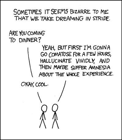
XKCD comic, by Randall Munroe
This comic shows some pretty basic defamiliarization comedy. The goal is to make something we take for granted seem as unusual as possible, to elicit the reaction of “when you put it that way, it’s pretty messed up”.

Strange Planet comic, by Nathan Pyle
This is still my favorite Strange Planet comic. I love the way it comes up with clear phrases that we would never, ever use to describe common things like tidying up (in panel 2).
Defamiliarization is the fundamental premise of Strange Planet, reflected even in the name (at least, when they're not just taking a normal Garfield-esque comic and running all the dialog through a thesaurus, which isn't the same thing, Nathan).
SCP entries use conventions that strongly promote defamiliarization - and the specific ways they go about it lend themselves to horror in particular. SCP's stylistic mainstays work to obscure what it is they're describing, and to describe it in a very slow and controlled way - which, narratively, builds uncertainty and suspense. It's part of how the better entries turn something that is supposed to be a manual into an actual story.
For instance: SCP entries usually play up their conceit by focusing on excessively technical descriptions, with an almost robotic emphasis on details that would be irrelevant and go unmentioned in more traditional prose (like the exact dimensions of the object in question, or the shift schedule of the personnel assigned to manage it). This sets a clinical/academic tone, which readers often associate with discomfort, and starts to create the feeling of distancing ourselves from the thing being described. It's also a little bit like a fairly standard part of magician routines: Before they do the trick, they show you a normal object and emphasize how normal it is, before doing something incredible with it. The overly-detailed description of the SCP itself is the literary equivalent of the magician inviting you to inspect and scrutinize their prop, to allow all of your senses to suggest that there is nothing unusual about it at all - even though you know, for a fact, that it is about to be used to do something very unusual. (That tension, by the way, coupled with the feeling of clinical discomfort or distance, is part of why SCP has such an innate leaning toward horror.)
But we're getting ahead of ourselves. You see, every SCP entry follows a pretty consistent structure, and in that structure, the description of the SCP itself (i.e. the supernatural thing that must be secured and contained) isn't the first thing you see. It's not even the second or third.
Anatomy of an SCP entry
The first part of an SCP entry is a completely uninformative numeric designation (SCP-897, SCP-014, etc.). As far as I know, these numbers are assigned mostly at random, so they don't tell you anything - it's not like the higher numbers are more dangerous or all vampires have 9 as the first digit in their number or anything. And although SCP entries have little nicknames in the index on the site, they typically don't contain any explanatory name for the thing within the entry itself. Entries don't say things like "SCP-173, codenamed 'weeping angels'" - they just say "SCP-173".
The second part is a codeword describing an SCP's class. This is a piece of jargon that isn't explained anywhere in the SCP entry itself. (If you start reading multiple entries, you might see classes like "Keter" and "Euclid" mentioned - and then eventually you might see that one of the classes is "Safe", which finally gives you an ominous implication about what the other terms might mean.)
And then, the first bit of prose you get is an explanation of how to contain the SCP. These descriptions, like the rest of the entry, emphasize irrelevant quantifiable minutia: exactly how thick the glass panes of its box must be, what materials the screws are made out of, etc. And, in the exact same tone that it uses to describe bland and mundane things like the dimensions of a room, it describes any unusual requirements of its containment: what level of security clearance you need to access it, how many people are allowed into the room at a time, whether or not it must be kept away from light, etc. There's no explanation yet of why those strange measures are needed - or even what's being contained - that all comes later.
Picture that sequence in movies, where you see a government agent going through several increasingly dire security measures as they access some secret facility or prison. This structure for the SCP entries has some of the same effects - to build up tension and anticipation. (Sometimes, at least - not every SCP is so dangerous or hard to contain.) But the effect is a bit more disorienting in text than in film. In any given frame of a conventional movie, you're typically getting a lot of visual information at once. In text, you're only getting what's given to you, one adjective at a time - and since we're such heavily visual creatures, this can be a little strange.
Oh, and of course, there's the simplest little trick that SCP uses, one that’s become emblematic of SCP as a whole: redactions. SCP entries are somewhat notorious for replacing words, numbers, or whole sentences/paragraphs with black bars (e.g. █████) or a phrase like "DATA REDACTED". Sometimes this is used to avoid coming up with identifiable details that could break immersion (e.g. "Oh, I live near there" or "I can look up the news for that date; nothing happened"). Sometimes it's just an easy way to create the impression of a shadowy government organization that hides the truth. And sometimes it's used used to make things just slightly more sinister or uncertain - especially when it's a word or phrase that you would expect to be unimportant.
Compare these two versions of the same sentence from a hypothetical SCP entry:
“The car is a █████ Ford █████, painted red, with seats made out of faux leather, and bears the license plate █████.”
versus
“The car is a 2019 Ford Escape, painted █████, with seats made out of █████, and bears the license plate 8RNU266.”
There’s a good chance that the second version is more creepy, or at least more interesting. The first version redacts identifying information, which both makes sense and doesn’t really change how we visualize the object much. The second version, however, uses its redactions to tell us that things like the color of the car and the upholstery are actually the important details that need to be withheld. So you’re probably more engaged by the second version. Why does the color matter? What are the seats made out of?
One of my favorite SCP entries goes even further, using redactions to actually tell the story. The first version is heavily redacted but tells a complete story. Then you are able to read a version with some of the redactions filled in. Then another, with more redactions filled in. Each time, the additional info adds a substantial new layer to the story - and begins to imply an entire other story too: Who is releasing these redactions, and why? This is SCP-835 (CONTENT WARNING: gore, body horror, adult content).
These things together - the numeric designations, the jargon, the containment-before-description introduction, the overly technical language, and redactions - form the backbone of how SCP entries defamiliarize their topics: they simultaneously over-describe and obscure. In particular, I think the "technical manual" tone is a clever blend of these things - at a certain point, all the minutia can make you just tune out, making the subject of the SCP entry slipperier and harder to understand. Imagine having the brain of an octopus in a jar. You could have every detail of it described to you: its mass, its weight, its texture, its smell, its color; every single dimension provided in full to the most exact measurement right down to the distance between every convolution on its surface. And yet, despite all those quanta, you wouldn’t necessarily be any closer to understanding how it works - how it can tell the difference between a crab and a rock, how it can make every square millimeter of its skin change color in unison to match its surroundings, how it can escape an aquarium tank and find a pipe that takes it to the ocean. You can hide magic in numbers.
Some really great SCP entries lean even harder into their format, and use stuff like footnotes, addenda, appendices, etc. to tell their story. These formatting conventions let them have interactions between multiple characters, and dramatic reveals of surprising information, extremely efficiently while still keeping the same dry overall tone. Like watching drama unfold in the comments and edits of a Wikipedia article that seemed boring, but is hiding something more.
(Un)familiar tropes
So the end result is a controlled defamiliarization, that relies in large part on obfuscation, to suggest a setting of a shadowy agency and a world full of strange uncertainties, and to depict a dynamic where the SCP foundation (and we as readers) are both able and unable to understand the subject - we can measure all its dimensions, describe in exact units the limits of its supernatural abilities, but not dissect why they work the way they do.
And if the XKCD and Strange Planet comics rely on defamiliarizing everyday objects for comedy, what SCP is doing is defamiliarizing familiar tropes for creepiness. Instead of a washing machine, it's a haunted doll or a video tape that curses you.
For instance: SCP-005 is just a skeleton key. Many SCP entries are references to similarly familiar tropes or concepts:
SCP-899 is the concept of children getting lost in the woods
SCP-1456 is those annoying mail-in contests that appeared everywhere but with a supernatural twist
SCP-437 is a summer camp where something went wrong (make sure to read the email addendum at the end of that one)
SCP-173 - the earliest and most famous entry - is basically just the Weeping Angels from DOCTOR WHO
Of course, not all SCP entries are meta takes on well-known/pre-existing tropes. Very many are completely original material. Even these, however, use the same techniques I described above - and in fact, these can often be more unsettling or enticing, because we might not ever get the "oh, I know what this is" moment that helps organize what we're about to read before we read it. There's some really neat stuff here:
SCP-917 is an otherwise apparently normal man whose face disappears along with the phases of the moon
SCP-051 is an antique medical doll that causes miscarriages
SCP-836 is a type of "cancer" that grows in the materials that make buildings, causing the buildings themselves to expand
In fact, the SCP entries that are not “just” adapting a well known trope are doing an extra trick with their defamiliarization: By using the “grammar” of defamiliarization, they are suggesting that the subject should be familiar to you. That is, by describing it in such a dry and quantitative tone, they are suggesting that it is not so strange (at least, to the person writing the description), even though the subject is clearly bizarre. Hearing someone describe something totally alien to you as though it were everyday tends to be an unsettling or fascinating experience (or both), which enhances the overall piece wonderfully.
Outside of SCP, I think this is perhaps best illustrated with one of my favorite absurd internet jokes - which, in true internet fashion, consists of a screenshot of a tweet that someone responded to on Tumblr:

The joke being made by skirtsuit-angel here relies on implying that an unusual thing is “totally normal”, creating a disconnect with the audience’s expectations. You can play that for comedic effect, or you can play it to unsettle.
Now, I'm not the final say on what SCP “really” is. It is, after all, a collaborative fiction project. SCP is a lot of things to a lot of people.
While there is a sort of style and standard of quality enforced, there's still tons of variation. You can find SCP entries that focus on subjects very different from the sort of magical-realism, small-scale/intimate creepiness I've been talking about:
SCP-1682 is a giant worm that lived on the sun
SCP-4030 is a Halloween-patterned blanket that causes your skeleton and other "systems" to float outside your body like an illustration in your anatomy textbook, and if you look at your skeleton it tries to kill you
SCP-682 is just a generic reptilian monster that's impossible to kill (and at one point it was popular enough that it became a sort of meme on the site, leading to a moratorium on new SCP entries saying "maybe try using this to kill SCP-682")
These might not be my jam, or they might be cool but not feel like they fit in with other SCP stuff (though SCP-4030 is charming in its own goofy way), but they are definitely still part of SCP. There's even outright comedy SCPs.
But the other entries I mentioned above hopefully give you a sense about the sorts of themes and topics that I think SCP is built to do very well. At the end of the day, a lot of the horror (or the fascination) comes from the idea that we can contain something but be unable to understand it, to still be unnerved by it even when it's under the greatest possible scrutiny. And defamiliarization works so well for SCP because it embodies that tension - like the Uncanny Valley, it forces us to consider the familiar as strange, and thus, potentially threatening.
From verbal to visual
Which finally brings me back to that art book cover.

It's a cool monster (specifically being evocative of early, non-anthropomorphic descriptions of angels, and also of pop culture monsters like Alucard from the HELLSING anime), but the whole scene just doesn't scan as SCP. There's no unease, no tension, no containment - there's just a big monster eating someone in a cool setting. It’s horror, but it’s not SCP’s take on horror. (To be fair, the contents of the art book may well fit SCP better; I’m just reacting to the cover here.) SCP is, after all, named after a fictional organization whose defining quality is that it contains these supernatural things, but they remain creepy despite that. None of that comes across here.
How would that come across in an image, though?
I just spent a while describing the specific lexical and grammatical conventions that SCP entries rely heavily on to establish their trademark tone. How could we represent these verbal rules visually?
To explore this, I want to take a look at the work of two artists that came to mind for me, and then end by looking, of course, to video games.
Filip Hodas is a 3D artist that likes to play with iconic imagery being shown in a different light. When thinking about SCP, I was reminded of his “Pop culture dystopia” and “Pop culture dystopia part 2” series. These pieces show huge, decaying metal/robotic structures in the shape of pop culture icons. They evoke a lot of the underlying sentiment of many SCP entries: something familiar, made out of strange parts - or with strange abilities. Arrangements of attributes that invite scrutiny: Why would this robot be in the shape of Mickey Mouse? Why would this floppy disk levitate objects around it? etc. I also appreciate that these pieces depict their subjects in broad daylight and disrepair, suggesting that they are (somewhat) inert - contained. But still strange.
Untitled, from Filip Hodas’ “Pop culture dystopia” series

THE OLD MOUSE, from Filip Hodas’ “Pop culture dystopia part 2” series
I also think that Simon Stålenhag really, really nails the same vibes that SCP does in a lot of his art. Stålenhag is an incredible artist; he’s done paleoart, retro-future dystopias, “kitchen sink sci-fi” pieces that harken to the better aspects of STRANGER THINGS…heck, one of his art books, TALES FROM THE LOOP, inspired its own Amazon series of the same name. When was the last time you heard of a series that was an adaptation of an art book?! I could talk all day about why Stålenhag’s art is amazing, but we’re nearing the end of this piece, so instead I’ll just briskly walk you through a small handful of his pieces, and then explain why they nail those SCP vibes I mentioned.

Untitled, from THE ELECTRIC STATE by Simon Stålenhag
The giant structure in the center of this piece is unusual, but it is also in the background and surrounded by totally mundane elements, undisturbed by its presence, like some light traffic. It’s not even raining that hard. The subject is strange, but the mood is “boring commute”.

Untitled, from THE LABYRINTH by Simon Stålenhag
Similarly, this piece also juxtaposes a bizarre structure against human elements that might not be alarmed by it. They’re looking at it, but we can’t see their faces. What are they thinking? Is this normal for them?

Untitled, from THE LABYRINTH by Simon Stålenhag
This scene looks completely mundane apart from the strange vehicle to the right, but is still full of little elements that introduce strangeness. For instance, the red checkered pattern and dandelion seeds painted on the walls suggest that we are somewhere “normal”, somewhere “safe” - like the parking lot of a school or supermarket. So why does that yellow door seem to have weighty locking mechanisms like it’s part of a bank or military complex?
And lastly, before we move on, I want to show just 3 images from Stålenhag’s TALES FROM THE FLOOD collection that feature some slightly more overt horror elements - take a moment to look at each one, see where your eyes wander, see what details you notice:


So what’s going on with these pictures? It isn’t quite “defamiliarization”, but it is something similar to what skirtsuit-angel was doing with their “honkwiching” joke earlier: They’re framing strange elements in a way that presents them as normal while still leveraging the fact that they are not.
One of the ways that Stålenhag accomplishes this is with a more muted color palette. There are few saturated colors, the overall contrast between the colors is low, and he uses cooler colors - often leaning towards blues or greens. An overall blue tint to some of these images make them look a bit more like amateur photos (since cheaper cameras often don’t white-balance outdoor images correctly), something we are used to thinking of as both “definitely real” and “probably not very exciting”. (A green tint, meanwhile, tends to give a subtly uneasy feeling, since we don’t typically encounter scenes that are lit green naturally.)
Stålenhag also makes each picture feel very still, even if we know that the objects in frame are supposed to be in motion (e.g. the traffic in the image from THE ELECTRIC STATE, the car being dragged down in the first image from TALES FROM THE FLOOD). Part of this comes from the framing - specifically, the perspective. Imagine that each of these paintings is a photo, and notice how the “camera” taking the photo is being held. It is at about eye level, where a human would be able to stand, parallel to the ground, and distant from the subject. It suggests an observer that is calm, even if they shouldn’t be, given what they are looking at. The other part of this comes from the composition of the objects in frame. We are not seeing things at the point of impact, when things are most kinetic and implied motion is at its loudest. In fact, in all but the second picture from TALES FROM THE FLOOD, motion isn’t even implied - it’s just inferred. And in the last picture, we’re looking at a scene after the interesting stuff has already happened.
Lastly, note that even in the more horrific images, no human is directly shown to be in danger. Like movement, threat is at most inferred. The most kinetic piece shows a creature attacking a tire that wasn’t attached to anything. The most direct implication of harm that we get in any of these comes from the fact that the car being dragged into the water still has its lights on, suggesting that someone might be inside. But we don’t see them. Even when danger is shown, it’s abstracted.
For Stålenhag’s works, this juxtaposition of mundane framing with strange subject matter - this mingling of calmness and eeriness - simultaneously creates a sense of containment and unease, in a way that visually evokes what SCP entries do verbally.
Finally, let’s look at video games.
The SCP Foundation has been the subject of many indie game adaptations, one of the most famous being SCP - CONTAINMENT BREACH, an open-source game initially released in 2012 that continues to be updated at least as of this writing. If there’s a direct visual adaptation of SCP itself, why didn’t I just make this whole section about that?
Well, it’s because they tend to look like this:

SCP-096 runs at the player in SCP - CONTAINMENT BREACH
There’s nothing wrong with the above image. Creepy monsters running at the player in a darkened facility is pretty standard stuff in horror games. But that’s also why it’s not especially SCP-like, even if it’s literally populated with the subjects of SCP entries.
No, the game that comes to mind is the 2019 video game CONTROL. This shouldn't be surprising, because CONTROL is basically also based on SCP (it technically has its own distinct setting - the Federal Bureau of Control, a secret branch of the US Government, rather than the SCP Foundation - but it's the same idea). The overall gameplay skews heavily towards action, but the tone and mood of the environment draw much more heavily from the tone that SCP achieves through defamiliarization.
Like the way they chose to set most of the game in a pretty well-lit and tidy government office building, as opposed to a creepy and oppressive underground research dungeon. It’s totally normal, even nice, except for, y’know, maybe a couple of things that are slightly off.

I’m really struck by how many elements some screenshots from CONTROL share with some of the Simon Stålenhag’s artwork. Consider the sense of stillness in this one, for example.
And then there’s the Containment Sector - the part of the building that is most similar to the type of setting where games like CONTAINMENT BREACH take place: a series of cells containing frightening supernatural things. But they’re not gory rooms and monsters. They look like this:

One of my favorite frames from CONTROL. Note the blueish-green tint to the scene, as well
In the center of the room is something that appears, by all visual indicators, to just be an ordinary fridge. It’s even spotlighted. Well-lit. The framing acting like the magician, inviting your eyes to inspect it, confirm that it’s totally normal.
Except that it’s in a soundproof room. With reinforced glass and thick concrete walls. And some sort of security personnel sitting in the room, staring directly at it.
You know something’s up. If everything were totally normal, the magician wouldn’t be trying so hard to show you that it’s totally normal. If this were just a fridge, it wouldn’t be here.
And indeed, the unnatural aspects of this particular fridge manifest if someone isn’t directly looking at it, for even a second. I won’t tell you what happens here. I don’t need to. I don’t even need to tell you what’s unusual about this fridge to begin with.
I just need to show you this picture.
Just a simple little image, made entirely out of normal elements, arranged in a way that suggests something strange and abnormal.