Rad monsters from bad media

When I was younger and visual media like movies or games were still primarily sold in physical boxes, I used to love walking down the aisles of video stores and looking at the packaging for sci-fi, horror, and action movies, looking for cool monsters.
A lot of times - especially in the case of movies that had their monster splashed all over the box - this stuff wasn’t very good. Often, the monster was the most interesting thing about it, and I would love telling my friends all about them, like a documentarian of weird crap returning from an expedition. Those years, I would spend summers walking around a pool with the other kids who weren’t comfortable taking their shirts off, and relay all the minutia of plot and biology from these movies and games.
So that’s kinda what I wanna do here: show you four monsters that are Pretty Cool Actually, despite the media they originate from being Maybe Not So Good. Call it a dumpster monster safari.
So without further ado, let’s dive into the dumpster:
Lizzie

RAMPAGE was a 2018 film based off a video game series that started in 1986 and whose most recent game (at the time of the film) came out in 2006. Despite it starring both Dwayne Johnson and giant monsters, the movie was mostly just a fart in the wind - owing partly to the fact that the appeal of the games was getting to be the giant monsters that wreck shit and eat people, and the movie had to be about the human stars trying to stop them.
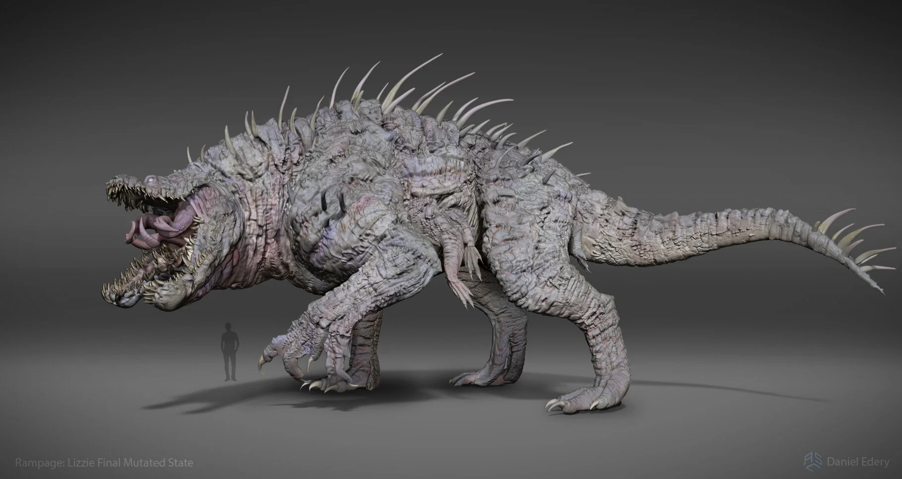
One of these giant monsters is named “Lizzie”, because she’s a mutant crocodile (as opposed to in the games where Lizzie was a mutant lizard, and the mutant crocodile was named…Crock). Thanks to Godzilla (and the Jurassic Park movies), “giant reptile” is the most common and well-worn city-stomping monster archetype - but in RAMPAGE, we actually got something really dope.

I love this design.
This is an everything-and-the-kitchen-sink pile of mean-looking monster parts done right.
She’s got a ridiculous carpet of spikes running down her back and tail, ending in a mace like an ankylosaur from hell. She’s got these splayed, fin-like frills on the side of her head for no goddamn reason other than looking cool. And then the mouth! Crocodiles already have tons of huge, visible teeth - but Lizzie’s got more teeth than she knows what to do with. She’s got teeth growing at irregular angles. She’s got fangs. She’s got a pair of tusks.
Honestly, putting boar-like tusks on a crocodile is what really hooked me about this design. It’s the sort of design novelty that casts all the other generic elements in a new light - the rest is just gravy. And well-executed gravy, at that: despite having the cartoonish design sensibilities of a WORLD OF WARCRAFT beastie, the VFX team really sold it. Lizzie looks great on screen.


This shot gives you a better idea of how gnarly Lizzie’s dentition is. She doesn’t have a single, well-defined tooth row; instead, teeth are scattered irregularly both inside and outside her lips - like her mouth is just a loose suggestion of where teeth should be. And she’s got these inward-pointing teeth lining the inside of her jaws and going back into her throat, like sea turtles.
I think part of why this design works is how wholly it commits to its wacky concept. This is an anatomy governed almost entirely by the rule of cool. At the same time, though, the way it’s put together is informed by real-world biology. The teeth and tusks look realistically blunted and chipped, rather than forming impossibly sharp points. The head accurately features tuberculate scales, compared to the more platelike ones on the legs. There’s a scene where Lizzie steps on a soldier, and you can see that her feet have these fatty pads that give more of an impression of gecko toes than a croc’s. You can really tell that the person tasked with making this upsized crocodile went more creative than just “a normal croc, but more”.
The creatures in RAMPAGE are supposed to mutants, and having their anatomy just go wild like this is a cool way to show that. At one point in the movie’s development, these critters were supposed to mutate even more, which would’ve led to some deeply rad designs that we can only see hints of in concept art - like this one from Jared Krichevsky, which shows Lizzie getting this wicked Venom-like grin and a bunch of extra eyes, including a couple on her chin. Oh and I guess there’s a bunch of extra legs and tails too. (Reminds me a bit of old monster art by Fealasy.)

There’s a lot of freaky Lizzie designs like this. Another one I love is in this piece by Daniel Edery, who was responsible for the overall design of Lizzie in the final movie.
There’s a lot that goes into making a movie. It’s an incredibly complex thing, and it takes huge amounts of effort and coordination just to finish one, much less make it successful. Often, the problems with bad movies are multifaceted and cascading, and there’s no single thing that will “fix” them.
But also, if RAMPAGE had featured a giant crocodile monster whose legs, paw, jaw, and tongue all start bifurcating into multiples, it would definitely have been at least 73% better.
Dr. Troy Abernathy

The Silent Hill comics written by Scott Ciencin are a hot mess.

They began in 2004 with SILENT HILL: DYING INSIDE - a story about a wealthy rockstar psychiatrist with a violent past that takes a patient to the haunted town of Silent Hill to prove that monsters aren’t real, only to find that monsters are real and they want the town to go viral so that more people will come to it. Then he dies and gets turned into a monster.
After that, it’s a story about this random posse of goths with dyed hair and lip piercings led by a 17-year-old-witch named Lauryn, who is dating a dude named Clown (but cheating on him with his brother, Payne).
They go to Silent Hill because Lauryn has a copy of the Necronomicon, and they think the town contains magic spells they can sell to rich people - but the real reason Lauryn went there is because cultists from the town turned her little sister into an evil monster that wants to rule Silent Hill, and Lauryn plans to…??? do something about it, I think??????
This rollercoaster is only five issues long.
Like I said, hot mess.
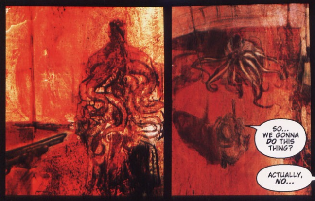
Troy Abernathy is the drive-fast-cars, do-lots-of-drugs psychiatrist from the beginning. His monstrous form only appears in less than a dozen panels, and it’s relatively simple - big tentacles erupt out of his stomach and chest - but I find it compelling anyway.

I think part of what draws me in is the fact that the movements of Troy’s human frame are completely divorced from the movements of the tentacles. His posture is weirdly stiff - in fact, the panel above is one of the only two times he moves his arms or legs at all. Even when his tentacles are whipping around killing people, Troy’s body is just kinda standing there - like his human figure is just a doorway that these violent appendages are pushing through. Which makes sense for the character, since at this point in the story he’s being puppeted by evil forces against his will.

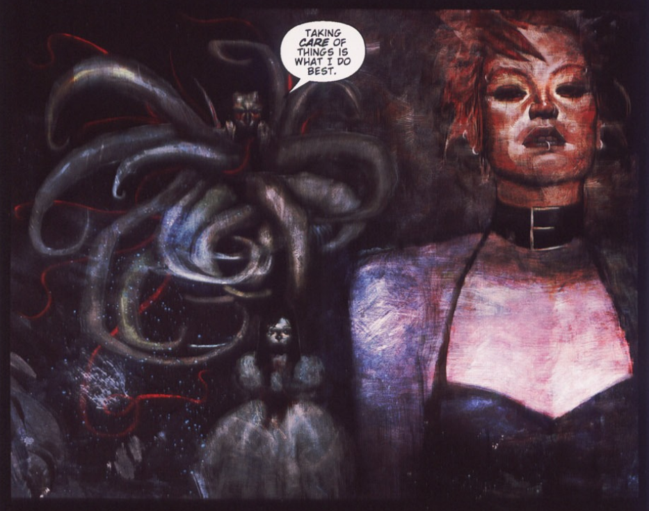
The other thing I like about this design is the way the tentacles coming out of his midsection are evocative of guts.
With the right color palette, all these squiggly bits do a fair impression of viscera dangling out of his body. It’s a cool little visual reminder that he’s a dead person reanimated as a monster, and a way to add something gore-adjacent to his design without any actual gore. It’s almost subtle, which stands out in a comic that’s mostly busy trying very hard to be edgy (one issue opens up with Lauryn describing the smell of burning human flesh as “peanut butter and dog shit”).
Before he became a monster, Troy sucked as a character. He was just another arrogant shithead, like Dr. House and the Punisher smashed together, the kind we’ve seen in comics like these a million times. After he became a monster, he dropped all the macho misogynist posturing and now he’s this weirdly subdued figure that dryly makes jokes about his old profession, while body parts that he might not even be able to fully control do terrible things around him.
And I haven’t been able to stop thinking about that design, and all its potential, for years.
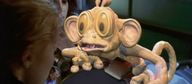
Ozyormy Goija

HELLPOINT is a fairly soulless DARK SOULS clone that came out in 2020. Mechanically, it offers little to distinguish itself from its inspiration (though you could do a lot worse), and the gameplay wears pretty thin pretty fast - especially with most bosses just being a big version of a normal enemy.
But putting a hack-and-slash adventure game on a sci-fi space station is neat. It’s got a mix of “old gods” and “grimy spaceships” kinda like what Warhammer 40K is doing, but with a lot more neon lights. There’s a reasonably interesting story in there if you really look for it (and want to ignore the weirdly dated racist caricature of an American Indian character, who is literally named “Tribal”), but mostly it’s just fun to dress up like an astronaut while two-handing a sword that’s taller than you are. You don’t often get to mix those things together.
Ozyormy Goija is one of the three evil deities that’s taken over the space station you’re on, and has my favorite design.
To begin with, I’m a sucker for extra arms that are used more creatively than just “additional fists to punch you with”. Here, the design is evocative of Vedic deities, who are commonly portrayed with multiple arms each holding their hand in different mudras (codified gestures with symbolic significance) to represent the many characteristics of that particular figure. (Another boss in the game fights you while meditating in a full lotus position, so it’s pretty clear that these designs are lifting from Hindu iconography.) In the case of Ozyormy Goija, though, the hands aren’t forming any particular mudras - instead, they’re just miming exaggeratedly, like an old theater performer.

Ozyormy’s head also has multiple faces, but instead of further mimicking depictions of many-headed Hindu deities, it’s a carousel of masks with different expressions (anger, joy, sadness, etc.), with tendrils streaming off its crown like the tassels of a jester’s cap. These aren’t exactly subtle or uncommon ways to build a “creepy masked performer”-type monster, but they come together pretty well here - especially with the fleshy frills near its neck, wrists, and ankles.
Next, I love the way Ozyormy Goija moves. Despite being a growling monster you fight in a literal pool of blood, it bounces around the arena like a dancer in a carnival parade.
This creature hops around on one foot at a time, it swats at you with exaggerated arcs, it does flips, and it even does this wacky starfish pose where it stretches all of its arms out in different directions. Yes, the music is your traditional grimdark choral chanting - and again, you fight it in a pool of blood - but this thing moves like it’s playing. Even when you defeat it, Ozyormy doesn’t seem that upset; it just strikes a pose and sinks into the pool of blood, like playtime’s over.
Finally, the concept art for this creature (by character/monster designer indiePaint) shows some really cool ideas (and ones that are less reliant on appropriating Hindu imagery). I’m a big fan of the version with an inverted face; upside-down heads always walk a razor’s edge between creepy and goofy, but I think it would’ve been neat.

In these sketches, you see that the core conceit of the design is a sense of playful grotesqueness, and I think that’s ultimately a lot of what makes this a relatively memorable design. Again, creepy clowns/mimes/theater performers aren’t exactly anything new - but they’re not tropes we typically see mixed with flesh and writhing appendages like this. A jester with sharp teeth or a bloody outfit? Yawn. A jester made of tentacles? Tell me more. It’s a sort of Lovecraftian-Shakespeare look that’s continued to grow on me even after I stopped playing the game.
Space Spiders

This is definitely the dumbest one on this list.
The 1998 movie LOST IN SPACE was a loose adaptation of a TV series from the 1960s. It gets a lot of flak as a pile of generic 90s nonsense. I mean, sure - it has a spaghetti plot that gets even sillier when they introduce time travel. Yes, none of the actors are on the same page as each other (Gary Oldman chews the furniture as a mustache-twirlingly-evil villain, but no-one else gets on his level). And yeah, the characters are all one-dimensional and either boring or annoying. But the special effects?
Also not good.

(I can’t get over that shot. Why is it flexing its teeth?)
These unnamed alien spiders are one of the antagonistic forces in the movie. Our heroes find them aboard an abandoned space ship from the future, and they possess a laundry list of generic creature-feature qualities:
They’re space-bulletproof (i.e. lasers mostly bounce off them)
Their fangs get super hot (???), allowing them to chew through metal
Each one is strong enough to dent solid metal bulwarks
They can survive in the vacuum of space
They roar at you
A single scratch from one of them will infect you, turning you into a human-spider hybrid that can lay eggs and telepathically control other spiders
If that last one made you go “wait, what?” then welcome to 1998’s LOST IN SPACE!
That becomes a major plot point in the dumbest way possible, as the character who was already a villain trying to ensure humanity’s extinction (by sabotaging attempts to relocate to another planet before pollution kills everyone) becomes a spider mutant and gets the brand new motivation of trying to ensure humanity’s extinction (by traveling back in time and infecting Earth with alien spiders). Also, it means they replace Gary Oldman’s actual acting with just his voice and that sweet, sweet 1998 CGI.

The funniest part of these critters is their “weakness”: If one of them is wounded, they drop everything to eat them. (Opportunistic cannibalism is one thing, but preferential cannibalism doesn’t really strike me as a particularly strong evolutionary strategy.) In the climax, our heroes injure the spider-villain and all his spider buddies instantly try to eat him alive. Then he falls into a time machine and dies.
Despite all the silliness here, though, there’s some parts of this design I actually like - and a lot of them are likely the direct result of trying to work within the limits of CGI technology at the time.

The space spiders are radially symmetrical, meaning you can cut them into evenly-sized repeating pieces along a central axis, like a pie. Yes, even though they seem to have a mouth and eye stalks in the “front”. It’s hard to tell given the quality of the footage, but it looks like they have a mouth between each set of legs, and can likewise extrude their eyestalks from multiple different openings on their body. You see this when they’re trying to bite into metal with their “active” mouth, which glows as it gets hot.
Radial symmetry exists in real animals (e.g. in starfish), but it’s rare enough that all animals showing it used to be lumped together into one taxonomic group (Radiata). In the case of the space spiders, the radial symmetry probably came from trying to simplify the design so that it would be easier to animate large numbers of them (since, like virtually any movie arthropod, they attack in swarms). A completely rigid central body is easier to model, and radial symmetry does a pretty good job of “justifying” that.
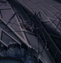
I also like the three Y-shaped legs. There aren’t really any tripodal species on Earth, so it’s an easy and appealing way to mark something as alien (it’s one of the reasons why the Martian machines in WAR OF THE WORLDS are tripods). Having the three legs each fork into two distinct forelimbs capable of moving independently, however, gives you access to a wider range of movements and postures - which is helpful if you want these animals to be able to move forward quickly without needing to rotate. The movie mostly has them scurry around like a normal six-legged bug, but you can get more creative than that.
Even the stupid mouths are kinda cool. “Sideways mouths” are a pretty common and lazy way to depict fictional arthropods, but I dunno - something about it works for me this time. Maybe it’s because it actually looks like a coherent mouth, one that can open and shut and hold things inside it, instead of just a random mess of pointy parts. In fact, now that I think about it, I actually appreciate that this is one of the rare fantasy bug designs that doesn’t have any extraneous mandibles or pedipalps on it - even though that decision was almost certainly made to have a simpler model to render (I betcha those teeth can’t flex in most of the models we see outside of close-ups).
Did these special effects ultimately age well? Fuck no.
But we don’t really expect people to not make art just because the technology it takes to realize their vision doesn’t quite exist yet. One of the things that’s most fun about these old effects is seeing this visual chronicle of when our reach exceeded our grasp, but we went ahead and did it anyway.
Sometimes, these artists pushed forward with what seems like an obliviousness to the limitations of their effects, and the most charitable way to describe the result is “Well, you tried”. Like this little guy, who also appeared in LOST IN SPACE:
But every now and then, you also see some glimmers of ingenuity - of people coming up with something they might not have, if they weren’t trying to make the most of their constraints. At the end of the day, I do think these spiders represent some pretty clever design work to come up with a creature they can successfully execute within the film’s technological and budget limitations.
And besides, most bad movies don’t give us anything nearly as interesting as frisbee spiders.